How to Build an Email Sign-Up Pop-Up People Don’t Hate
 By Nora Ellison
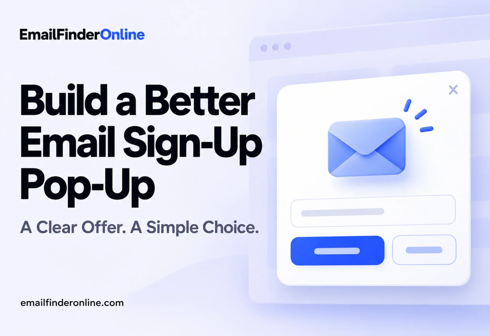
These email pop-up tips come down to one idea: ask for an email address at a moment when the visitor is already interested, in a way that doesn’t block what they came to read. Show the form after some engagement rather than on arrival, offer something specific in return, keep it small on mobile so it doesn’t cover the page, make closing it easy, collect consent with a clear opt-in and test variations one by one. The mobile and consent points rest on Google Search’s guidance on intrusive interstitials and the UK data protection regulator’s consent guidance, both checked on October 26, 2026.
What an email pop-up is for
A sign-up pop-up is a small form that appears over or beside page content and asks the visitor to join your list. Done well, it turns a one-time reader into someone you can reach again. Done badly, it hides the page and sends people back to the search results.
Google’s Search Central page on avoiding intrusive interstitials and dialogs draws the line clearly. It defines interstitials as overlays on the whole page and dialogs as overlays on part of it, and it warns that intrusive ones may frustrate users, erode trust and make it hard for search engines to understand your content, which may lead to poor search performance.
Each tip below aims to grow a list without crossing that line.
Email pop-up tips for timing
Pop-up timing matters as much as the wording on the form.
Let people see the page first
A form that fires the instant a page loads asks for commitment before the visitor knows whether your content is useful. Wait until they have shown some interest. Common options are a time delay, a scroll depth (for example, partway down an article) or a second page view in the same visit. Pick one, then test it against an alternative.
Avoid shifting the layout
If your form or banner pushes content down as it loads, readers lose their place. Google’s web.dev article on Cumulative Layout Shift explains that unexpected layout shifts can make people lose their place while reading or click the wrong link or button. It sets a good CLS score at 0.1 or less and treats values above 0.25 as poor. The article also notes that shifts within 500 milliseconds of a user’s tap, click or keypress can be excluded from the calculation, so a form that opens in response to a click is treated differently from one that pops in on its own. Reserve space for inline forms and overlay pop-ups rather than inserting them into the flow of the page.
Don’t repeat yourself
Once someone closes the pop-up, don’t show it again on every page. If your form tool supports it, set a frequency cap or remember the dismissal for a while. Respecting a “no thanks” keeps returning visitors from feeling chased.
Choose the right trigger
Triggers decide which visitors see the form and when.
| Trigger | How it works | Good for | Watch out for |
|---|---|---|---|
| Time delay | Shows after a set number of seconds | Simple setups | Fires even if the visitor is skimming |
| Scroll depth | Shows after the visitor scrolls a set share of the page | Blog posts and guides | Short pages may never trigger it |
| Exit intent | Shows when the cursor moves toward closing the tab | Desktop visitors about to leave | Doesn’t map neatly to phones |
| Page count | Shows on the second or third page in a visit | Engaged readers | Misses one-page visitors |
| Click | Opens when the visitor clicks a link or button | Content upgrades, “get the checklist” links | Needs a visible link to start it |
| Inline or banner | Sits in the page or at the edge, no overlay | Mobile visitors and search traffic | Easier to scroll past |
Exit intent aims to catch desktop visitors at the moment they would otherwise leave. Click-triggered forms interrupt nobody, since the visitor asked to see them.
Make the offer worth an email address
People trade their address for something they value. Generic “subscribe to our newsletter” copy gives them little reason to.
- Match the page. Offer a checklist on a how-to article, a template on a planning guide or a summary of new posts on a blog.
- Be specific. “Get the 10-step setup checklist” says more than “Get updates.”
- Say what happens next. Tell people what you’ll send and how often, so the first email isn’t a surprise.
- Keep the opt-in form short. An email field and a button are often enough. Every extra field is one more reason to stop.
- Write a plain button label. “Send me the checklist” is clearer than “Submit.”
Collected addresses still need care later. Typos and fake entries creep into any list, so it’s worth reading up on how to verify an address is real and on keeping bounce rates down once the sign-ups start arriving.
Design for clarity and accessibility
A good pop-up is easy to understand, easy to use with any input method and easy to dismiss.
- Make closing obvious. Put a visible close button on the form and let a click on “no thanks” dismiss it.
- Support the keyboard. The W3C’s modal dialog pattern says that when a modal dialog opens, focus moves to an element inside it; Tab and Shift + Tab cycle through elements within the dialog; Escape closes it; and when it closes, focus generally returns to the element that opened it.
- Label it for screen readers. The same pattern gives the container a role of dialog with aria-modal set to true, and a label through aria-labelledby (pointing to a visible title) or aria-label.
- Keep text readable. Short headline, one sentence of detail, high contrast between text and background.
- Match your brand. Use the site’s fonts and colors so the form looks like part of the site, not an ad.
Follow the mobile rules
On small screens an overlay can hide nearly everything, so this is where Google’s guidance matters for mobile pop-ups.
Google’s interstitials page recommends using banners that take up only a small fraction of the screen instead of full-page interstitials, so users and search engines can reach the content as soon as they land. It names newsletter sign-up prompts as one of the uses for these small containers. Its list of common mistakes to avoid, unless legally mandatory, is short:
- Don’t obscure the entire page with interstitials.
- Don’t redirect the user to a separate page for their consent or input.
The page also suggests that many content management systems have plugins for standard sign-up dialogs, and that using them can help because developers can roll out improvements at scale.
Mobile checklist
- ☐ Form covers only a small part of the screen, or sits inline
- ☐ Close button is large enough to tap and easy to find
- ☐ Content stays visible behind or around the form
- ☐ No redirect to a separate page to collect the address
- ☐ No layout jump when the form loads
- ☐ Keyboard does not hide the email field or button when typing
Because exit intent relies on cursor movement, consider a scroll or page-count trigger for mobile pop-ups instead.
Collect consent the right way
If you email people in the UK or EU, how you collect the address matters legally. The guidance below comes from the Information Commissioner’s Office (ICO), the UK’s data protection regulator, and applies to the UK GDPR. Check the rules for every country you market to.
Use a real opt-in
The ICO’s guide on how to obtain, record and manage consent says consent must be an unambiguous indication by clear affirmative action, which means people must actively opt in. It lists ticking an opt-in box and clicking an opt-in button or link as examples, and says you can’t rely on silence, inactivity, pre-ticked boxes, opt-out boxes or default settings.
Say who you are and what you’ll do
According to the same guide, a consent request should be prominent, concise, easy to understand and separate from other information such as terms and conditions. At a minimum it should name your organization, explain why you want the data and what you’ll do with it, and tell people they can withdraw consent at any time. The ICO’s page on valid consent adds that consent should not be bundled up as a condition of service unless it is necessary for that service, which is relevant if you gate a download behind marketing sign-up.
Keep records
The ICO says you must be able to show who consented, when, what they were told at the time and how they consented. For an online form that means storing a timestamp, the wording shown and the data submitted with each sign-up.
Make withdrawal easy
The ICO also says withdrawing consent must be as easy as giving it, ideally through an easily accessible one-step process. A clear unsubscribe link in every email covers that on the email side.
The ICO’s separate guidance on direct marketing by electronic mail under PECR, updated on 28 April 2026, covers the soft opt-in rules for existing customers. Read it if you plan to email buyers who didn’t tick a marketing box.
Test, measure and repeat
You won’t know which version works for your audience until you measure it.
- Pick one metric. Sign-up rate (sign-ups divided by people who saw the form) is a sensible starting point.
- Change one thing. Headline, offer, trigger or timing, not all four at once.
- Run an A/B test with traffic split evenly and long enough to cover normal weekly patterns.
- Watch the side effects. Check bounce rate, time on page and later unsubscribe rates, not just sign-ups.
- Keep a log. Record what you tested, the dates and the result, so you don’t repeat old tests.
Merging pop-up sign-ups with contacts from other sources later? Our article on growing a business contact list explains how to keep it relevant.
Weighing tools for your wider contact data work? You can compare plans on the pricing page.
FAQ
Do pop-ups hurt SEO?
Google’s guidance says intrusive interstitials and dialogs can make it hard for search engines to understand your content, which may lead to poor search performance. Small banners and dialogs that leave the content accessible are the approach it recommends.
Are exit-intent pop-ups allowed on mobile?
Google’s page doesn’t single out exit intent. Its mobile-relevant advice is to avoid covering the whole page and to avoid redirecting people to a separate page for their input, whichever trigger you use.
Can I pre-tick the marketing consent box?
Not under the UK GDPR. The ICO says pre-ticked boxes, opt-out boxes and default settings do not count as consent.
What should I record when someone signs up?
The ICO lists who consented, when they consented, what they were told at the time and how they consented.
How do I make a pop-up accessible?
Follow the W3C modal dialog pattern: move focus into the dialog when it opens, keep Tab within it, close it with Escape, return focus afterward and give it an accessible label.
Ship a better pop-up this week
Start with the changes that cost nothing: delay the form until visitors engage, shrink it on phones, add a clear opt-in and a visible close button. Then run your first test and let the numbers guide the next change.